After 60 years of starfields and howlarounds, we ask the question: what makes the perfect Doctor Who title sequence?

The original Doctor Who title sequence was borne out of experimentation. Some savvy technicians at the BBC realised that they could create some interesting swirling patterns if they pointed a television camera at its own monitor – an effect known as a howlaround, which can resemble clouds, swirling vortexes and even flames.
This was the effect that was adopted in 1963 – a montage of pulsing shapes which was meant to represent the TARDIS in flight. Originally, the designers had experimented with merging the First Doctor’s face with the swirling patterns, but the final effect was deemed too frightening, particularly when it was accompanied with the Radiophonic Workshop’s ethereal theme music.
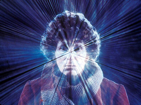
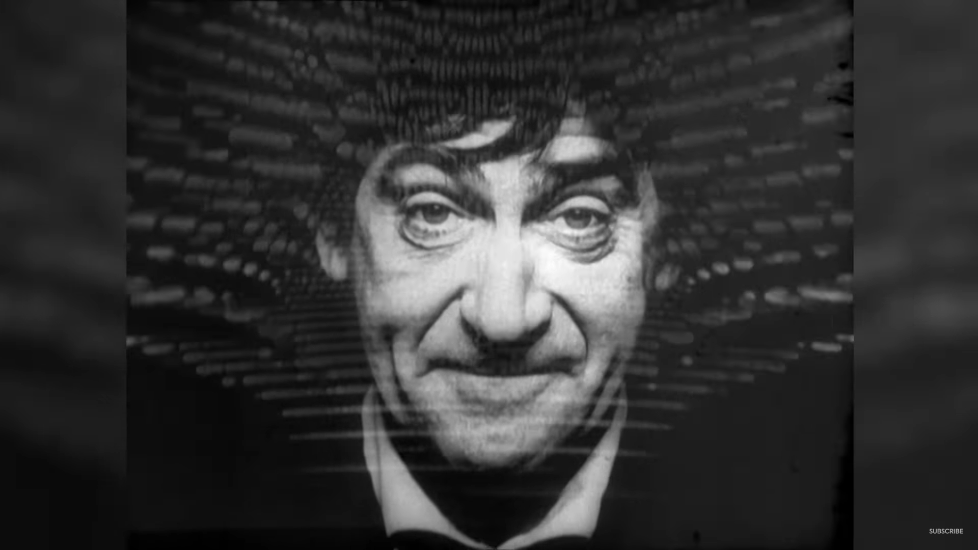
Soon, though, the designers did manage to incorporate the Doctor’s face into the intro, and one could argue that this is one of the most important ingredients of the ‘perfect’ Doctor Who title sequence. From 1967 until 1989, the face of the incumbent Time Lord was always present in the intro, starting with Patrick Troughton in the Season Four story ‘The Macra Terror’ all the way through to Sylvester McCoy in ‘Survival.’

Interestingly, the face component was dropped from the Doctor Who title sequence when the TV movie came around in 1996, and indeed the production team continued to omit it when the series returned in 2005.
In some ways, its absence is understandable. Finding a way to incorporate a still photograph of an actor – or even superimpose moving footage – without it looking obviously chroma keyed or out of place is tricky in the age of high definition. But as the modern Doctor Who title sequences evolved, the designers did experiment with re-introducing the face.
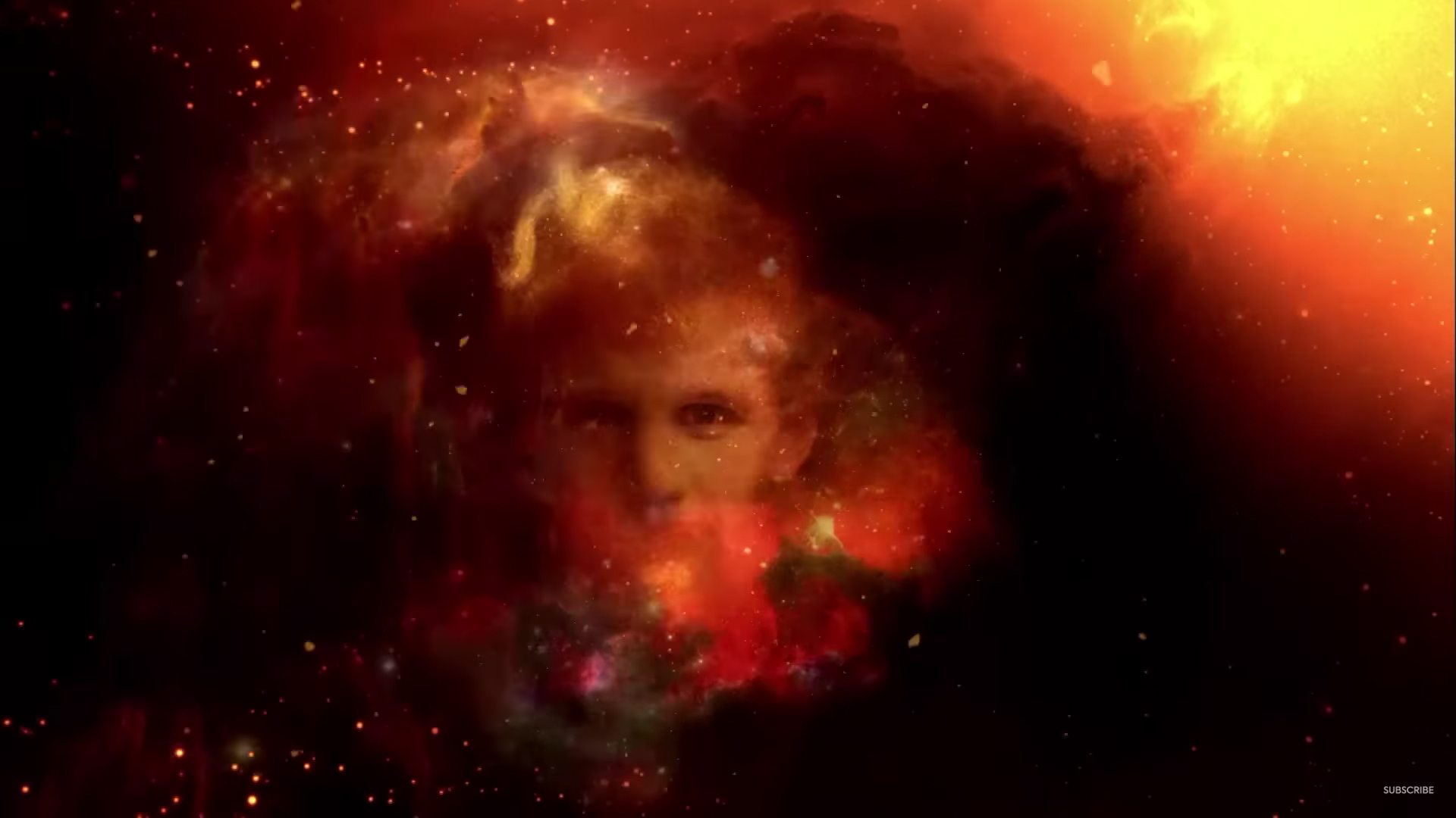
In Matt Smith’s case, this came in the 2012 Christmas special ‘The Snowmen,’ where an image of his face was merged into the dust clouds. But it was a subtle inclusion – a true ‘blink and you’ll miss it’ moment, with Smith’s face more naturally incorporated into the surroundings than it had been during the Classic series.

The same was true for Peter Capaldi’s Doctor Who title sequence two years later, and this time the production team decided against showing the Doctor’s full face. On this occasion, they focused purely on the Twelfth Doctor’s ‘attack eyebrows,’ drawing more attention to the actor’s striking eyes. Interestingly, this was the first (and so far, the only) Doctor Who title sequence which had been designed by an out-and-out fan, developed from a YouTube concept that had been spotted by the designers.
And even though the Doctor Who title sequence for the subsequent Jodie Whittaker era was missing the Time Lord’s face, the Thirteenth Doctor’s intro did hark back to the ‘howlaround’ effect of the First, Second and Third Doctors. For Series Eleven, the production team created a series of pulsing clouds which resembled a Rorschach picture, harking back to the series’ more abstract, other-worldly roots.
But the Doctor Who title sequence for the Thirteenth Doctor also incorporated a sense of movement and of travelling through time and space, the intro finishing with a sudden burst of speed through a warping starfield before cutting to black.
Again, this is a feature that has been present in the majority of Doctor Who title sequences – the sense of travel through time and space. There were hints of this in the Patrick Troughton title sequence which was first introduced in ‘The Macra Terror,’ but it was most obvious in ‘The Time Warrior’ in 1974. This was Jon Pertwee’s second title sequence, and was the first to make use of the slit-scan technique which gave the illusion of travelling down a mysterious tunnel.
This Doctor Who title sequence was adapted in 1975 for Tom Baker, and ended up being the longest-lasting – and arguably most famous – of all the Doctor Who title sequences. Like the 1963 intro, it’s meant to give a sense of travelling through time and space, even though it’s hard to define what all the colours and shapes represent. It is also the first to feature the TARDIS itself as it journeys through the vortex – a component which would appear in (almost) all of the title sequences after 2005.
And perhaps one of the most ‘striking’ uses of the TARDIS is in the 2010 Doctor Who title sequence, which was very traditional in some ways in that it showed the Doctor’s machine tumbling through a vortex. This vortex, though, was made up of thunder clouds and showed the TARDIS being repeatedly struck by lightning. Again, it’s unclear what this is meant to represent. Is it really the time vortex? And if so, why is there thunder and lightning?
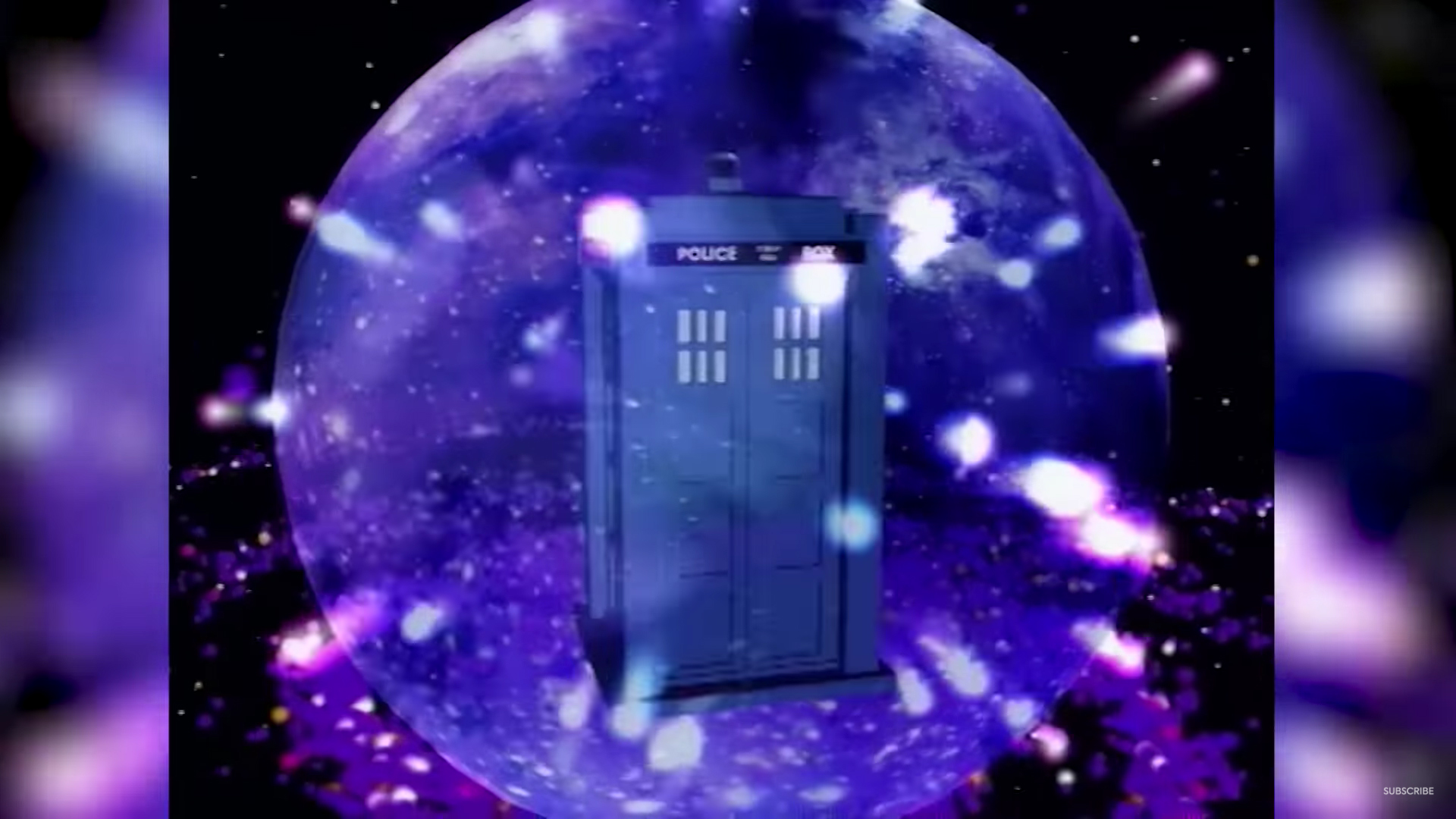
Overall, though, this Doctor Who title sequence continued to emphasise the ‘travel’ element of the series, and this is arguably one of the intros’ most important ingredients. And arguably one of the most creative examples of this can be seen in the series’ first CGI title sequence which was developed for the Seventh Doctor Sylvester McCoy. In this version, the Doctor Who intro shows the TARDIS travelling to the very start of the universe, the sequence beginning with the Big Bang which quickly forms into star clusters and a giant, purple galaxy.

It would be fair to say, then, that movement, time travel, space travel and an overall sense of other-worldliness are some of the key features of the ‘perfect’ Doctor Who title sequence. Oh, and the Doctor’s face (sometimes.) Indeed, it’s hard to imagine a Doctor Who title sequence which doesn’t jump through some of these hoops, and there is a lot to be said for staying true to the series’ tone and drawing from the lessons of the past.
At the same time, anyone tasked with designing a new Doctor Who title sequence has a tough job ahead of them, and it will be interesting to see what the designers come up with for the Fourteenth Doctor David Tennant, and of course the Fifteenth Doctor Ncuti Gatwa. Will they incorporate these key ingredients from the past, and perhaps even make a retro-inspired title sequence to honour the series’ 60th anniversary? Or will they throw out the rulebook and come up with something truly unique?
Time will tell. In the meantime, which is your favourite Doctor Who title sequence? Let me know in the comments below.


In regard to the incumbent Doctor’s visage within the title sequence, it could be argued that it should also display benevolence. If the howlround is suitably disconcerting and mysterious, then the Time Lord must be that reassuring figure who will shepherd the audience through the latest thrilling instalment. It is this avuncular quality, to my mind at least, that is a hallmark of the character – no matter the persona. Out of all the leads, both Pat and Jon exemplify this in their respective openers, while Sylvester’s light entertainment wink is playfully effective in its own right.
Post-2005, there is unfortunately less scope for this as the show runners are keen to portray the character as either a self-serious superhero with little time for softness or as a thoroughly aloof creature who shuns even the most basic intimacy. Ironically, out of the modern crop, “attack eyebrows” Capaldi was one to preach “be kind” as he met his Waterloo but alas, the DW creatives could not muster a even a hint of this in his opening credits. Perhaps someday there will be a restoration but until then, Russell will probably riff on the Salkinds again for the latest incarnation of the Super-Doctor. Oh well.