Every new era of Doctor Who brings a new console room! So what might the new TARDIS interior look like in 2023?
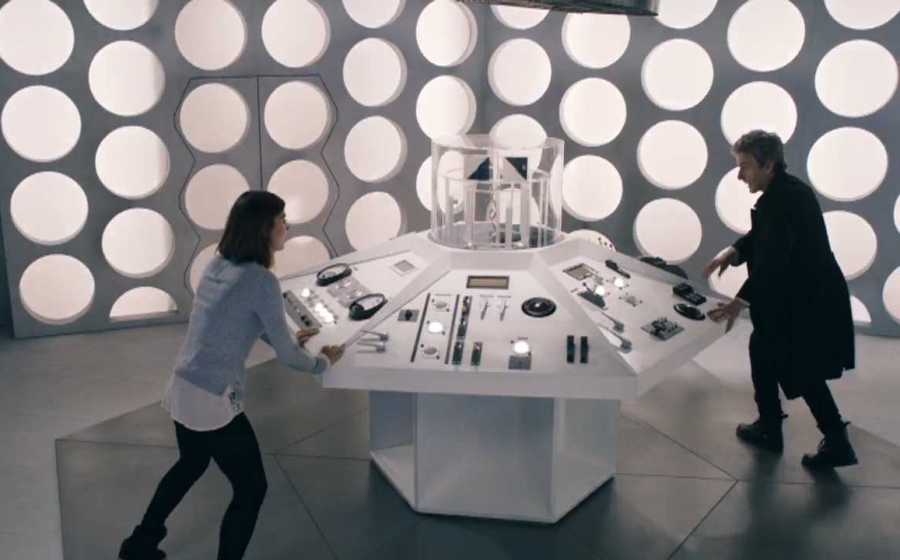
The TARDIS interior has regenerated almost as much as the Doctor himself. In the beginning (and indeed for most of its Classic run) the TARDIS interior took the form of a whitewashed, scientific laboratory, bathed in bright lights and almost clinically clean. The odd piece of anachronistic furniture could usually be found in the console room, such as a grand chair or a hat stand, but for the most part the TARDIS interior was a piece of scientific mastery – a simple vehicle for the Doctor to travel in.
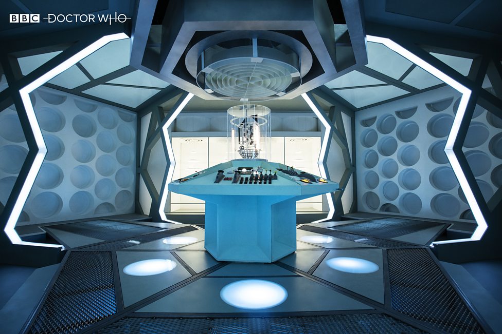
So could the new TARDIS interior be in a similar vein in 2023? It’s possible, as the love for the retro console room has certainly been in evidence over the last few years. For example, it was recreated in the Twelfth Doctor episode ‘Hell Bent’ as an alternative TARDIS which the Doctor stole from Gallifrey. And then there was the TARDIS interior of the Fugitive Doctor which followed the same design, albeit bathed in a more blue, esoteric light.
(C) BBC Studios
For Classic fans, these nods to the series’ past are always winners, and with the show’s 60th anniversary fast approaching in 2023, it would make sense if the production team took inspiration from the programme’s lore. After all, the new logo is based on the one from the 1970s, so perhaps other elements will be making an appearance too.
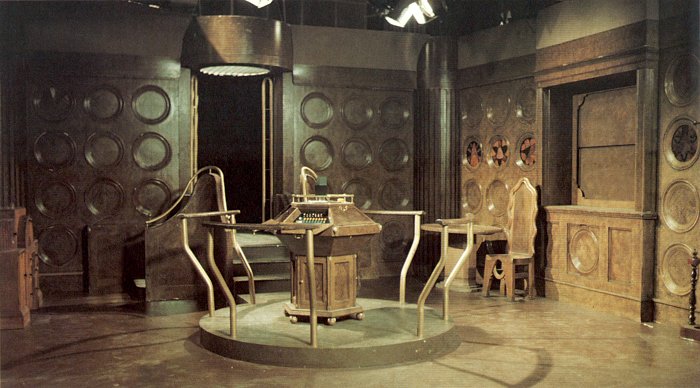
That is not to say that all the classic TARDIS interiors were the same. For instance, during the Philip Hinchcliffe era of Doctor Who, the console room was given a complete overhaul; in story terms, this was explained away as the discovery of “a second control room.” And it couldn’t have been more different from the one that came before. This TARDIS interior was wood-panelled and ornate, more akin to a drawing room than a high-tech, alien machine. Even the doors were made of brass.
(C) BBC Studios
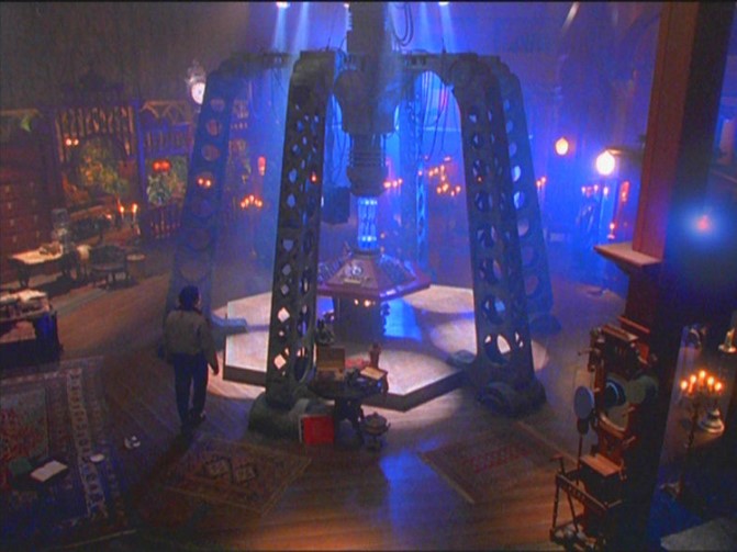
Alas, this console room only lasted for one season, but when Doctor Who was revived in 1996, the TARDIS interior undoubtedly had echoes of the one from the Philip Hinchcliffe era. Of course, the TV movie had a Hollywood budget, so it was about 20 times larger than the one which was constructed in TV Centre. But again, it was more evocative of something out of a H.G. Wells novel, chock-full of antiques, pot plants, ornaments and book cases. Unquestionably, this was the Doctor’s home – not a laboratory.
It is possible, therefore, that future TARDIS interiors will follow this trend. There were certainly echoes of it in the Twelfth Doctor’s TARDIS, with blackboards and bookcases lining the platform which overlooked the main console.
It is also worth noting that the TARDIS interior from the TV movie has inspired many of the console rooms that followed. Until 1989, the console’s time rotor was a glass cylinder which rose up and down with the movement of the machine. But in the TV movie, this was changed – the glass cylinder was extended to run the full height of the room, with moving parts inside the cylinder which rose up and down when the TARDIS was in flight.
(C) BBC Studios
And this design was retained for many of the TARDIS interiors that followed – certainly for the Ninth, Tenth and Eleventh Doctors’ TARDISes (and the War Doctor‘s if we’re being super-specific.) But these console rooms broke away from the aesthetic of the TV movie in that they reverted back to the idea of the Doctor’s machine being an alien vessel rather than a home. Indeed, the Ninth and Tenth Doctors’ TARDIS interiors were more evocative of the Nostromo in Alien, complete with steaming vents and loose cables and, of course, oceans of atmospheric lighting.
This was something that the Doctor’s new companion Rose noted straight away upon seeing it: “It’s alien,” was her succinct response, as she glared at the coral-effect pillars rising up out of the floor. Viewers would later learn that all TARDISes were “grown” rather than built, which would explain the ethereal, plant-like aesthetic of the Ninth Doctor’s TARDIS interior. (And yes, we know coral is technically an animal, but still.)
Interestingly, this more organic-looking TARDIS interior hasn’t been seen since 2010, but the Thirteenth Doctor’s console room tapped into a similar idea with its crystalline aesthetic; after all, the time rotor in her TARDIS looked more like a rock than a component of a carefully-engineered machine.
There is a precedent, therefore, for a TARDIS interior which is inspired by nature. And whilst we know from ‘Time Crash’ that (somewhere) there is a console room draped in leopard skin, we don’t think the Doctor will be embracing animal pelts anytime soon. But it would be interesting to see something which used water or ice as its theme – something like Graves’ ice palace from the Bond movie Die Another Day, or even a diamond-esque design that could channel some of the ‘Midnight’ energy from Doctor Who Series Four.
What would be interesting to see would be a return of the stairs, platforms and walkways which were present in the Eleventh and Twelfth Doctors’ TARDIS interiors, as these would please fans on every level. Ahem.
One of the best examples of this kind of design can be found in the alternative Ninth Doctor adventure ‘The Scream of the Shalka,’ with a control panel which is ‘cocooned’ by a ribbon-like staircase which spirals around the whole console room. It’s wonderfully mysterious and atmospheric, although it is manned by a holographic version of the Master, which could obliterate Doctor Who canon as we know it. But it’s an idea.
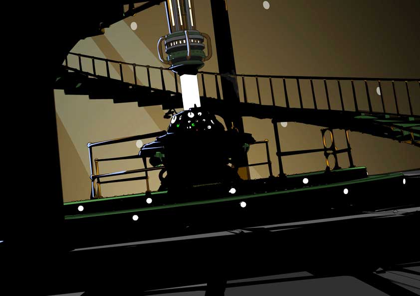
(C) BBC Studios
And whilst we’re still waiting for an official unveiling of the new TARDIS interior for 2023, some tantalising clues have been given by some of Doctor Who Series Fourteen‘s directors, speaking in the May issue of Doctor Who Magazine.
Director Chanya Button said: “Oh my gosh, it’s enormous. I mean, it’s absolutely beautiful. It’s sort of church-like in scale, and yet it’s also this intimate space that takes you from one place to another – to even larger, wider worlds.”
Another director Tom Kingsley, meanwhile, said: “So much detail and love and thought has gone into it. You can point the camera anywhere at it and it looks amazing.”
Finally, we have this from director Rachel Talalay: “I was around for the four months watching it being built. My DP [director of photography] and I were having all these conversations about how to light the wall roundels, and things like that, but I just kept thinking, ‘It will never be ready in time…’ So the fact that, in the last couple of days of my contract, we finally got on there, was amazing.”
So it certainly sounds like the new TARDIS interior for 2023 will big – bigger on the inside, you might say. A “church-like” scale brings to mind memories of the Eighth Doctor’s TARDIS with its cloister rooms, whilst Rachel Talalay’s comments about lighting the roundels point to the many and varied shapes that adorned Matt Smith’s first TARDIS interior, many of which were lit from within. That being said, the Classic Series had roundels which were lit from behind, so we can’t rule anything out.
In the meantime, what kind of design would you like to see for the new TARDIS interior in 2023? And which is your favourite of the ones we’ve had so far? Let us know in the comments below.


Leave a Reply